
-

Brand Guidelines
Rules and guidelines for correct representation and usage of the Bing Maps brand in your mobile applications.

Mobile Branding Guidelines
Because mobile devices come in a wide variety of screen sizes and resolutions, the best way to determine sizes for the Bing Maps logo is relative to a physical unit of measurement. This means the designer of your mobile application will need to provide multiple versions of the Bing Maps logo, at varying pixel sizes and screen resolutions, according to the devices you wish to support.
Data Provider Attribution
The Bing Maps logo and data provider attribution must be visible on Bing Maps mobile applications. The following guidelines and principles for displaying Bing Maps data provider attribution are pursuant to the Bing Maps Platform Terms of Use.
- Data provider attribution information must be displayed on a single screen, within a similar or related location, based on menu options (e.g. Settings, About, More).
- Bing Maps logo must be present on the top left-hand corner of the data provider attribution screen.
- Bing Maps data provider attribution information can be accessed through the Get Imagery Metadata method in Bing Maps REST Services.
General Rules
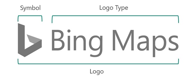
The Bing Maps logo has two components – the stylized ‘b’ symbol and the logotype which is based on the Segoe typeface. By default, you should use the complete logo. While Bing Maps and the Bing symbol are trademarked, there is no need to use a trademark bug ™.
When applied over Bing Maps, the Gray Logo R115 G115 B115 should be used. Use the gray logo on white backgrounds and the white logo on dark backgrounds. To meet the minimum 4.5:1 contrast ratio for accessibility when the logo is used on a photo background, use a gray logotype on light images and a white logotype on dark images. For example, on a roadmap, use the gray logotype and on imagery, use the white logotype.
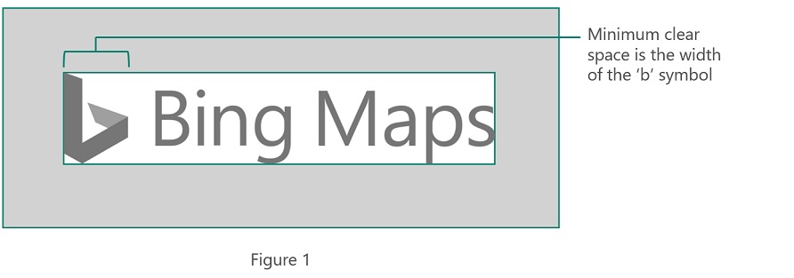
Clear Space
We respect the logo by giving it some space. The preferred clear space around the logo is equivalent to the width of the ‘b’ symbol (see figure 1).
In Mobile applications the logo should equal 1/5 of the smallest dimension of a screen or 0.5” (12.5 mm) wide, whichever dimension is greater. When measuring in pixels, it must appear at least 50 pixels wide.
Recommended Sizes
Below are four recommended sizes to use, depending on the size and ppi depth/resolution of the screen being developed for:
 Small (
 Medium 1 (
 Medium 2 (
 Large (
Things to Avoid
- Don’t change the symbol / logotype relationship.
- Don’t stretch or compress the logo.
- Don’t add anything to the logo.
- Don’t add effects like shadows and gradients to the logo.
- Don’t create logo “lockups” by adding text to the logo.
- Don’t place the logo over busy photographic backgrounds.
- Place the logo on colors that provide sufficient contrast.